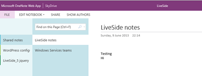
Microsoft has updated its Office Web Apps today, opting for an even “flatter” look and feel, adding easier access to SkyDrive, and even adding some features. Frederic Lardinois over at TechCrunch noticed the changes, and then confirmed them with Microsoft:
“We did introduce some Office Web App updates earlier today,” a Microsoft said. “As we’ve said in the past, we’ll continue to bring the Office features that you value most to the Web and this is just one example of that.”

OneNote users will immediately notice the changes to the new look navigation bars to the left. Lardinois noticed some other changes, too:
Microsoft has also changed the design of the top menu across all the apps and cleaned up the design of the Ribbon menu across the board. The occasional semi-skeuomorphic icon remains in the Ribbon, but for the most part, the Office Web Apps have now gone completely flat.
LiveSide reader Nathan noticed the changes too, and sent us a tip (thanks!) with a couple of more changes:
The Office web apps now have a header with a search bar in the ribbon and a new design.
Also, the file menu now has a “new” tab for creating new documents.
We’re not sure why the Office team hasn’t blogged about the changes yet, maybe they’re a bit gunshy after another UI update, this time to their blog, got hacked, making for a somewhat embarrassing debut. In any event, check out the new look Office Web Apps, and let us know what you think.

