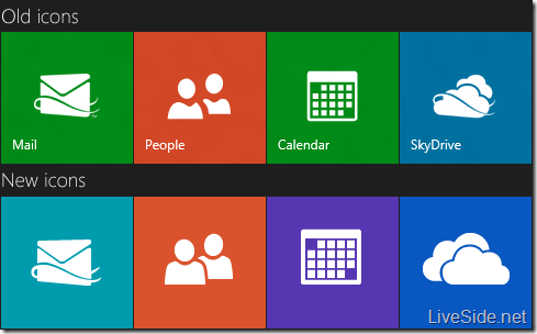
Earlier this week we sighted what we believed to be a new SkyDrive logo appearing on the Microsoft Surface website, where the direction of the cloud has changed, as well as the removal of the yellow swirl/ribbon. This swirl during the Wave 3 and Wave 4 era defined what constitutes as a Windows Live service. However, since Windows Live is no more, Microsoft has decided to give these logos a slight Metro style makeover. We were able to confirm that the SkyDrive logo will be changing, as shown in the below comparing the logos between what we saw before in leaked images and the new logos that will be coming soon:
The SkyDrive logo had undergone many facelifts since its debut in 2007. The most recent logo with two clouds and a yellow swirl, first appeared two years ago in 2010. Below is a brief look at the many SkyDrive logos that has existed throughout its 5 year history:
Whilst we think the new logo looks like what would be shown on a cloudy day for a Weather app, we’d like to know what you think of the new SkyDrive logo. Do you like the new SkyDrive logo? Let us know in the comments below.


