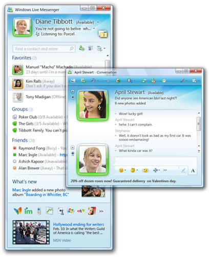
You probably read about Windows Live Messenger 9 (Wave 3) on here before but let’s take an even closer look. What are the changes compared to windows Live Messenger 8.5?
The Look (and visible features)
The first thing you will notice of course is the completely different look:

[Windows Live Messenger Main Window – 8.5 (Vista Business) and 9.0 (Vista Ultimate)]
What we notice first in the above is that the buttons for Shared Folders, Live Space, MSN Today and Mobile have disappeared. The only thing familiar that’s left in the top part is the Mail button, and that one has moved to the right. So where have they gone?
This is what we see when we hover over our own DP. There they are! Well eh most of them anyway. Online files what? Yes Online files, not Shared Folders

See they did think about the sharing folders we already have on our computers too, can’t just get rid of what we already shared now can they! The new thing will be sharing your files online with Skydrive (not working yet, Page cannot be displayed).
We are also missing the tabs (really? do you use them?). Apparently they moved to the bottom even though at the moment I only see Today (MSN Butterfly) there. If you look at the picture Chris posted before you see more of them.
And what happened to the buddies in our contact list? They have been replaced with colored blocks. The colors stand for your contact’s status:
You also see this coming back in the DP rims (your contact’s and yours), they color along with status too. As you also notice the number of statuses has been reduced to 4, no more “Be right back”, “In a call” and “Out to lunch.” Online has been renamed to Available.
In addition to the changing color for the rim in appear offline the DP will also fade.
Hey, I see the brush appear there in the top corner! It’s hidden there till you hover over the header, so what is that for? We are used to it for changing our Messenger’s color scheme. Well we can still do that but there’s more! Scenes!
Changing the scene will change the look of the main screen, but it won’t change the look of the conversation screen. Why won’t it? Because your contact’s choice of scene will determine what that looks like, a few examples are shown above. In addition to the themes available you can also drag and drop your own picture in the header, this will also be seen in your contact’s conversation screen.
Just as with DP and Personal message this will be stored in the cloud if you have Messenger set to use the same display picture and personal message wherever you sign in ( Tools > Options > Sign In tab under General).
We already noticed the black transparent box when we hovered our own DP, you will see the same look come back when you hover over your contact’s name in the contact list:
In this screenshot you also see the What’s new feed. This will rotate the What’s new feed you see on Live Spaces, you will be led there if you click on the What’s New link, and also inform you when people change their DP or personal message. We also see Scott is playing a song…now that’s nothing new but what is new is that you can display both your Personal Message and Now Playing at the same time!
Here you see the header in my main screen (where contact list is) with Personal Message and Now Playing and the convo header I saw when messaging Scott earlier.
Let’s look at the Main windows some more, there are two features that were not present in Windows Live Messenger 8.5, namely:
Favorites:
Neat, now you can have the ones you speak most to at the top at all times, no more searching through the contact list. Though I use the contact search bar for that.
Groups:
Groups, isn’t that how we sort our contacts? It was, yes, but now that is called Categories. Groups is new and is to create a multiple person chat that will stay till you delete the group. Each group can hold up to 20 members.
Not everything is functional yet, everything under the Group button is grayed out (Group Website, share Photos, Share Files, Discussions). After you created your first group the link/Category will disappear, don’t ask me why…it’s not logical at all but well eh if you want to create another group right click an existing group and choose “Create a group.” A group will look like this in your contact list:
Leaving a Group is done by right clicking on the group in the contact list and choosing “Leave this group”
You can also convert a category to a Group by right clicking on said Category and choose “Convert to group.”
I mentioned the contact search bar before, huge improvement there too: previously we had a search bar for Contacts and one to search the web, now these are integrated into one! Yay! Saves room!
But..but..wait a minute…what’s that button there in the middle? I never saw that before in 8.5, let’s investigate, it says Change contact list layout…
Now that’s way cool! We can now choose whether we want to show a DP in the contact list or just the colored block…and for both Favorites and Other! Can even vary with the size of the DP. Labeling can be done by “Display name” or “First and last name” and organizing by ”Categories” or Online status. We also see the return of what we saw so briefly some when in a previous beta: sort within categories by status! They also speak of SMS contacts, shouldn’t that be Mobile? They are grouped as Mobile anyway.
New Applications and (not directly visible) Features
Multi Point of Presence (MPOP)
You can now be signed in in different locations and receive your messages on all those locations
Alerts and Sounds
Those both got their own tab now
For all of the events you can set one of the sounds that come with it or add your own sound:
Ever wanted to let your contacts know vocally that you are online? That’s possible too, we call that Signature Sound:
Now first time “Turn on Signature sound” will be grayed out and you can’t enable it by just checking the box, don’t freak out over that (it’s confusing I know), just click the Change sound button and set a sound. You’ll see it’s enabled after you did that. Then next you can disable/enable as you normally would. Again here you can also set your own, so be creative! Getting sick and tired wondering where all those sounds come from? They’ve thought about that too, check “Mute my contacts’ Signature Sounds.”
Hold on! What about a setting a special sound for your contact instead of listening to the ones they’ve set? You can do so for sign-in sound and message sound if you right click on said contact in the contact list and choose “Choose sounds for this contact”. Here you will again have the choice of either setting one of the sounds already available or adding one of your own choice. You can set a different one for each if you want!
Photo Share
A new application is Photo Share. You start it by clicking on the Photos button in the conversation window. Next you browse to a picture you like to share and Click on Open. You will see the application load inside the conversation screen:
Scott asked a good question there and unfortunately I didn’t find how to save a shared picture either, am I overlooking or… If not there that would definitely be something to ask for before it goes final!
Note: If you try to send a screenshot with paste it will add it to Photo Share or start Photo Share instead of sending it.
How does Messenger integrate with other Windows Live Applications and Services
We already know we can open up either Hotmail or Windows Live Mail directly from Messenger but there’s more under the hood. Think about directly going to your Live Space and Skydrive (Online files), watching your friends profile or sending him/her an SMS. The search bar is powered by Live Search. And what about the new What’s New Feed, that’s also closely tied with the feed on spaces. Surely with Groups we’ll see even more integration with the web…
This is still a beta and things may or may not work (already noticed a few here) and things can still change too. I may have even forgotten or overlooked things, please let me know if I did in the comments below, thanks 🙂
Updates:
I forgot something quite visible and new :O
You can now hide the toolbar at the top, look at the arrows I’ve put a white square around.
Should you ever want to hide display pictures or hid them by accident and want to show them again, there’s an arrow to do that on the left side of the conversation window too, just hover towards there and it will appear.
Links
– Links (including mail button) now open in the default browser.
– Links in the contact list and conversation headers are clickable.
Display Pictures (Tools > Change display picture)
– You can now have an animated display picture, it will take GIF files. Thanks BV2312, I completely forgot about that one already.
– You can create your own display picture from webcam snapshots.
– Create your own dynamic display picture with Mood tiles:
This requires a webcam. As you can see you assign an emoticon to the picture so changing it is as easy as putting in one of those emoticons in your conversation.
New Windows Live Betas – Download Wave 3 Now!
Read more LiveSide reviews:
Wave 3: Windows Live Movie Maker Beta
Wave 3: Windows Live Mail – Calendar, Calendar, Calendar (and more)


