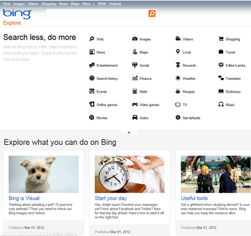
Yesterday we stumbled upon what appears to be a new look for the Explore pages on Bing.com, combining a new set of icons with a possibly more metro-ish look, and a new set of pages devoted to explaining Bing’s offerings:
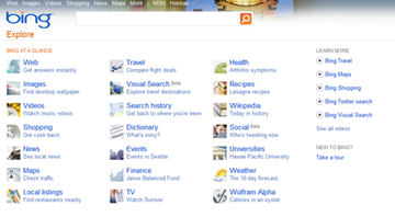
We use the Explore link quite a bit to gain quick access to Bing’s various blogs, and were surprised to see the new look show up, as we had just visited the page a few days ago when it still had the old look (image from our look at Bing’s last big update to Bing Explore, in June of 2010):
Unfortunately, however, with Bing’s increasing reliance on “flights” of testing to various subsets of users, there’s no real way to be sure that this update has gone live, or we’ve just hit upon another test, as many of our users have with incarnations of Bing HTML5 revisions.
The new sub pages (Bing is Visual, Start your day, and Useful tools are shown above) are dated March 1, apparently from when the new look arrived. While we kind of like the new look, the Bing blogs link has moved all the way to the bottom of the page, which is a slight inconvenience.
And in another bit of Bing news, the German regional Bing blog points to another big data update for Bing Maps (English translation). Interestingly, the English language Bing Maps blog makes no mention of the updates. Back when Chris Pendleton was running the blog we used to get new imagery updates all the time, and we suspect these updates have been ongoing, but just not blogged. The new imagery includes hi-res images of London’s Olympic Stadium, some “bizarre” structures in Qatar, and more.
Are you seeing the new Bing Explore pages? Let us know what you think in the comments.


