As the dust is now pretty much settled from Microsoft’s significant announcement and release of the Windows 8 Consumer Preview last week it’s about time we took a close look at some of the apps that come with the preview. as followers of mine on Twitter will know I am keen SkyDrive user and advocate and so it makes sense that I take a close look at that app.
I have only been able to try out the SkyDrive app on a PC with a mouse and keyboard and both and app and OS are both only preview and not feature complete.
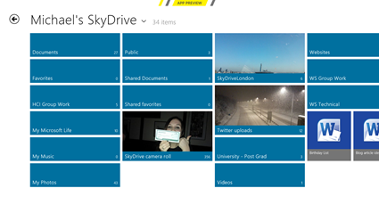
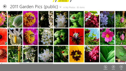
When first opening the app users are presented with a lovely Metro display of all the folders and files found in a user’s root location. Scrolling to the left (with finger, keyboard or mouse) will present more files if they can’t all be shown on one screen, this works just like the Windows 8 Start Screen and most of the Windows 8 Preview apps. Folders are shown as a double width tile whereas files are shown as square tiles and if available the folders and files will show a thumbnail of the content.
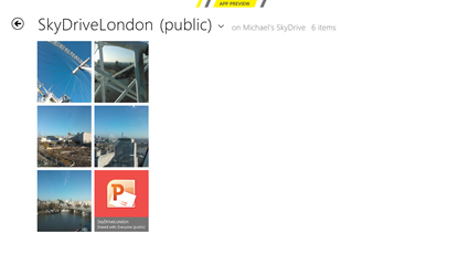
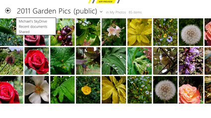
When clicking on a folder the contents in shown in the exact same way as the root folder, however, the folder title is shown along side the name of the of the parent folder. Note the “(public)” beside the title which denotes that the folder is visible to anyone, if a folder is not public then no additional notation is provided.
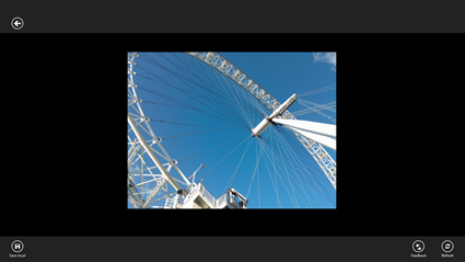
Clicking on a photo then displays a single photo to the user. Sadly there is no way to continue to move through the contents of the folder in this view and a user has to go back from a single file and then click the next one. I would hope to see this changed so that users could browse the contents of a folder in this “zoomed in” view as well as the folder view when the final app is released. However, it is possible for a user to zoom into the image using the scroll wheel or multitouch if the image was uploaded at a large enough resolution.
Right clicking (or swiping up from the bottom of the screen) presents some actions that a user can perform. The top left arrow is to move back to the folder view, the bottom left button allows a file to be saved to the PC from SkyDrive and in the bottom right is a feedback button and refresh button.
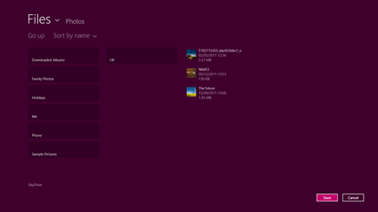
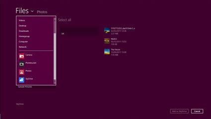
When saving a file the default Windows 8 Metro file explorer is used. Sadly there is no way to save a file on SkyDrive to another app or service through an app which is possible within the Metro UI but seems to have been disabled so users can only save files locally.
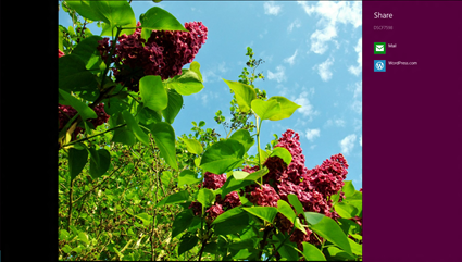
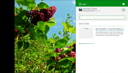
It might seem like a limitation to not allow users to save to another service however it perhaps makes sense as it is possible to “share” a single file using the Charms Bar on the right. This allows a file to be shared with any app installed that makes use of the share contract within Windows 8; on my system that is only Mail and WordPress.
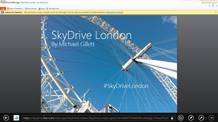
Going back to the SkyDrive London folder if a user were to click on the PowerPoint file then they would be taken to the Office Web App. For this it was the Metro version of Internet Explorer that opened however this could be configured to being the desktop version or even a different browser I believe.
There are some other folder available within the SkyDrive app that mimic some of the functionality found in the web version. If a user clicks on the arrow beside the folder name then a drop list appears with three locations; the root folder (Michael’s SkyDrive in this case), the recent documents folder and the shared items folder. These same locations are listed on the left hand sidebar within the SkyDrive website.
Some other notable features of the SkyDrive app are that right clicking in any folder presents the app bar with additional functionality. There are the feedback and refresh options already shown but there is also an add option which allows users to add anything to the folder that is being looked at.
When adding a file the user is presented with same file explorer as when saving a file. However, this time there is access to other Metro apps installed on the PC so that a user can upload a file to SkyDrive from a different app or service.
That is pretty much all I have discovered within the SkyDrive Metro App and bearing in mind it is only an App Preview it feels very reliable and fairly feature rich. Having said that though there are a few things that seem to be missed from the app such as being able to save or share more than 1 file at a time. It would also be great to browse through a folder when only seeing a single file and even slideshow functionality would be good. I think it would also be helpful to allow users to specify whether they wanted a document to be opened in an Office Web App or in a locally installed app.
Please let us know about anything else the SkyDrive app does that I might have missed.
Obviously we are still many months away from Windows 8 shipping and in that time a lot of work could be done on the SkyDrive app but even in it’s current state it’s a great app and well worth trying out if you haven’t already.
You can download the Windows 8 Consumer Preview if you haven’t already; the SkyDrive app comes bundled with it.

