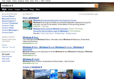
After months of waiting and a few “peeks”, it looks like Bing has finally turned on the HTML5 version of its “decision engine. We’ve heard some rumblings about it being ready to go, but tonight for the first time we are able to see it for ourselves:
A screenshot doesn’t quite do the new interface justice, as there are a number of quite nice transitions between pages, the page loads are extremely quick, and there a number of new features, including the “pinned” navigation header that Yusuf Mehdi showed off at Imagine 2011. Interestingly, the nav bar “pins” when you scroll down in “web” and “images”, but doesn’t stay visible when scrolling using the “video” tab, for example. Also, a new tab, one that some of our readers have already reported seeing, is the “Blogs” tab. This doesn’t appear to show up for all searches (it’s visible above searching for “Windows 8”, for example, but didn’t show up here in a search for “Japan earthquake”.
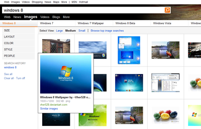
First impressions are that there’s quite a lot of black, the feeling is quite stark in contrast to the softer tones of Windows Live and the previous Bing incarnations. The new Images page has some rather jarring dividing lines between each image, and there’s lots of black text throughout:
A quick check of the usual blog sources isn’t revealing any news about an HTML5 rollout, but we’re definitely seeing it here. Are you? We don’t even know if we’ll still have the new version in the morning (and by the way you can’t tell from the home page, you have to do a search to get the HTML5 experience), but it’s here now. Let us know what new features you’re spotting if you have Bing – HTML5, and your first impressions.


